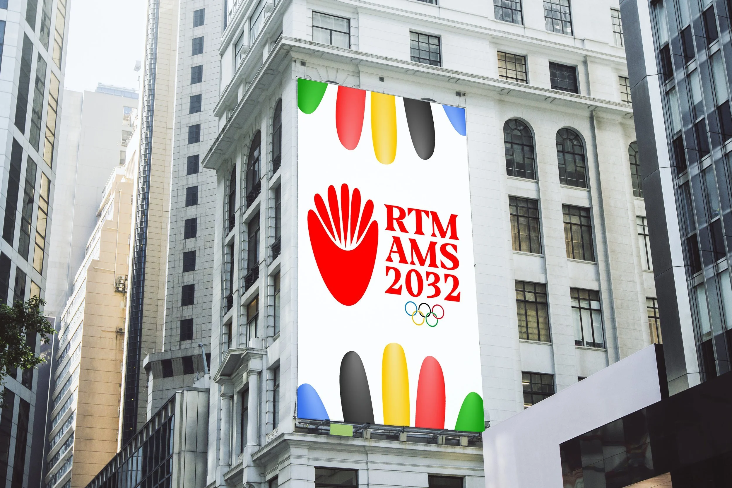
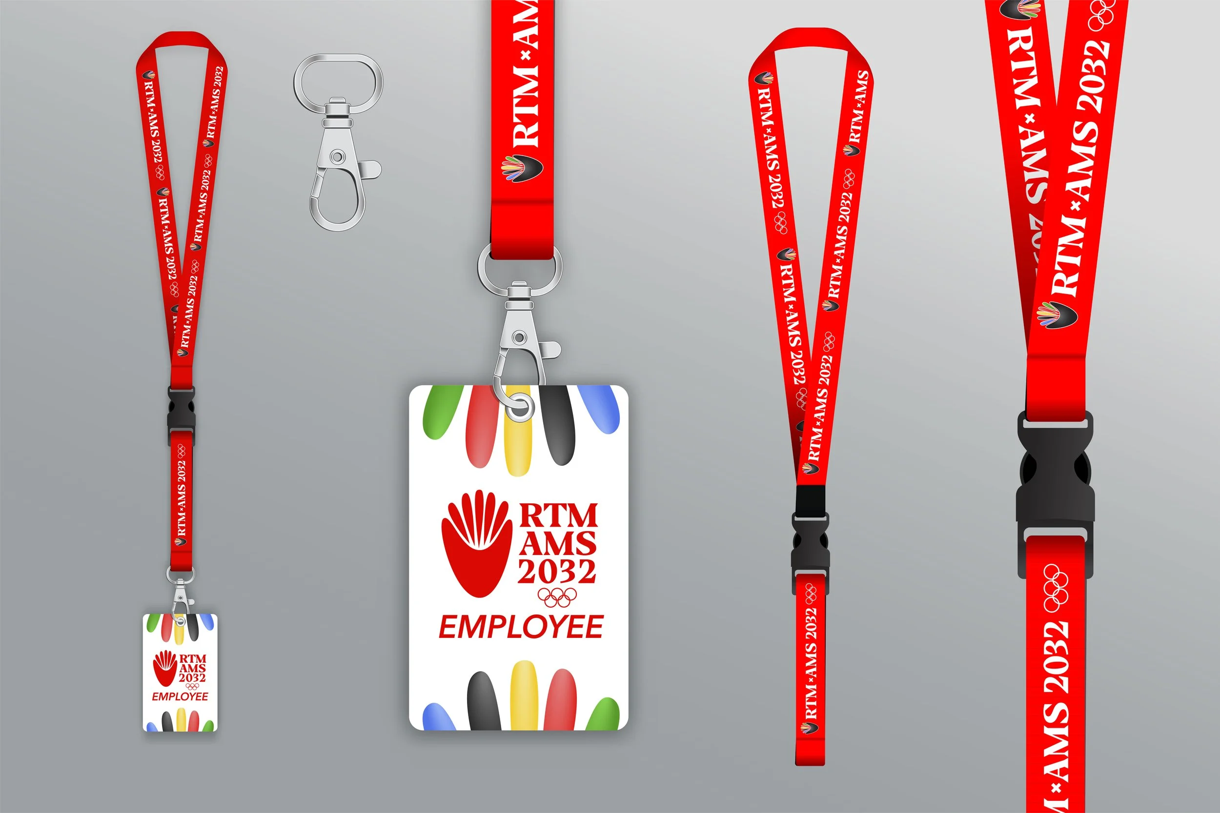
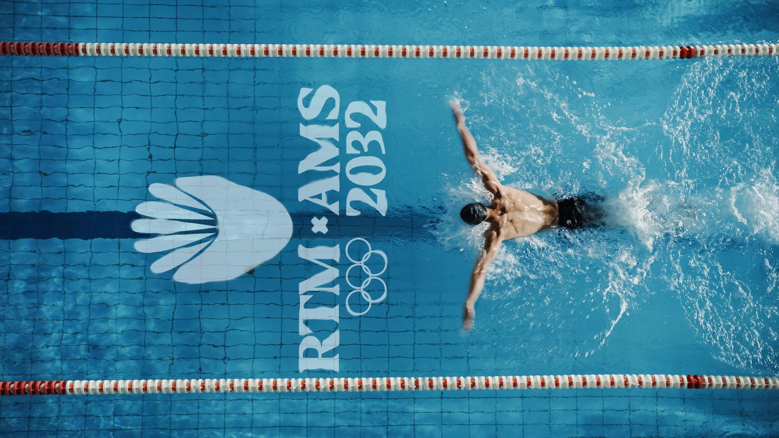
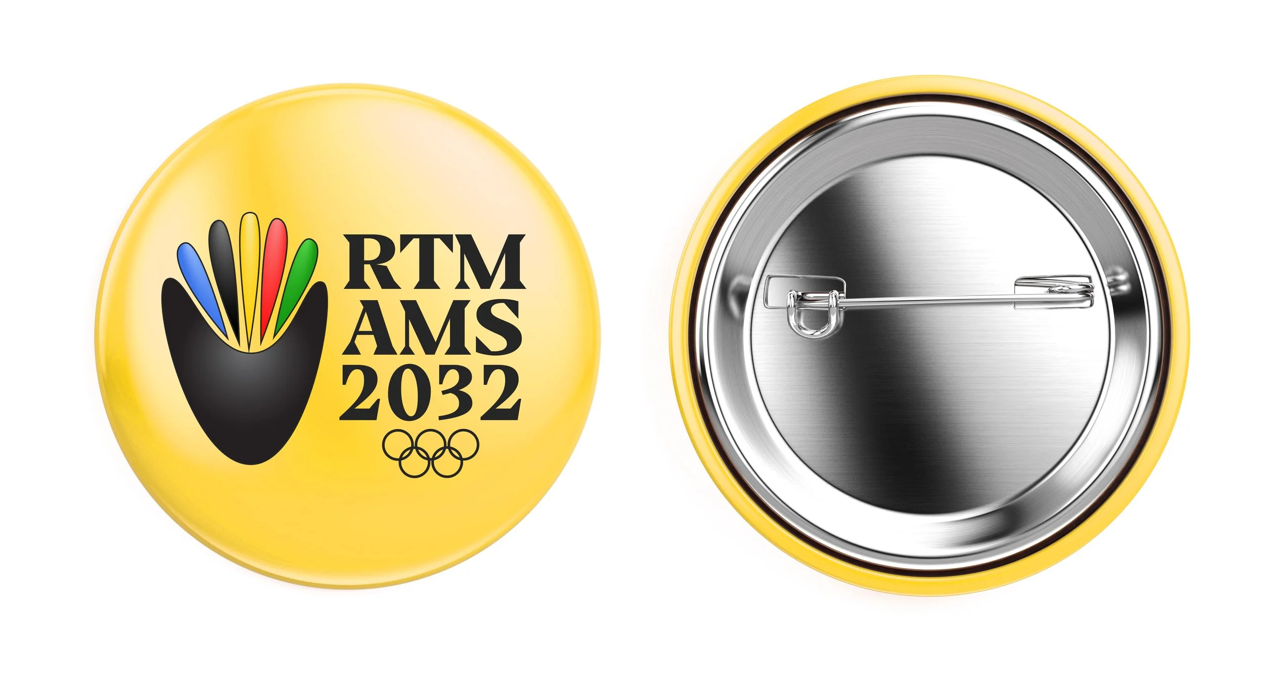
Rotterdam x Amsterdam Olympic Bid 2032 Logo
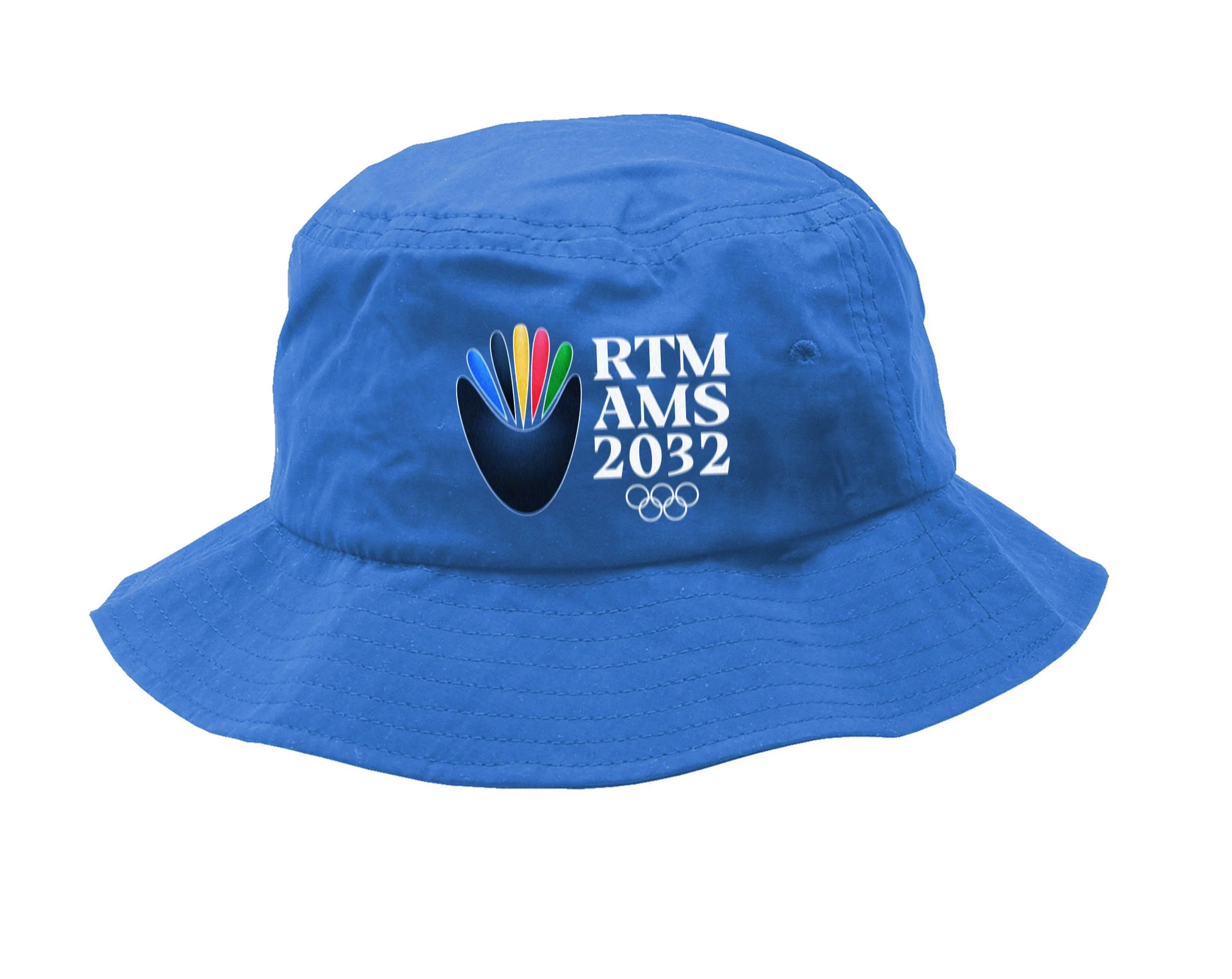
This logo design is inspired by the shape of tulips that bloom all across the Netherlands, and from the shape of a Herring fish tail– the fish of the Netherlands and signifier of both Rotterdam & Amsterdam’s roots as a trading port. The entirety of this abstract design can be unified to form a torch-like shape as well, similar to the one used in the 1928 Summer Olympics that were held in Amsterdam. The colors of this logo reflect the traditional Olympic logo colors that have been used for generations.
Final Logo

Primary logo

Secondary logo
Color Treatments


